


Data Visualisation in Blender
I’ve been working with Blender for several different projects now and more and more I find out how powerful this package actually is. I’ve been experimenting with different tools for data visualisation (for example, D3), but Blender also seems to be a suitable candidate for this job.
How exactly can a multimedia/rendering software package help me with dataviz you might wonder? Well, Blender uses the very powerful and flexible Python scripting language to allow users to write their own add-ons. Using Python, it is really easy to do things like reading out a file, converting the numbers to the appropriate format and more of these common actions. Using information from some other sources to get started, I was quickly able to create a solution that fitted my needs.
My goal was to create a circular graph from a timestamp-based dataset. The dataset that I work with is basically a tab-separated file, containing 24 hours of data, and 3 different “channels” of data. A few lines of this file look as follows:
2013-10-17 00:20 60 0.478 33.8
2013-10-17 00:21 64 0.427 33.8
2013-10-17 00:22 64 0.425 33.9
2013-10-17 00:23 62 0.432 33.9
So to convert this data into my envisioned result (a radial graph) I planned on the following:
- Read the file line by line, and put each column into a separate array.
- Normalize the value ranges, make sure each value occupies the same range.
- Convert the x and y coordinates to polar coordinates.
- Create curves from these lists of polar coordinates.
- Fill and extrude the curve to create the 3 dimensional shapes.
All of these steps are covered in the final script; below I will further discuss some of the functions I created myself and which might help other people with similar issues.
Normalizing the values
for display purposes it is often helpful to be able to map your values onto values that are actually presentable on screen. For example, you’d want some value range (0-1024 for an 8bit input) to be mapped to a small image with a height of 300px. Or you just want multiple values with different ranges (like I have) to be in the same range, to make visual comparison easier. To accommodate this, I created a (tiny) Mapper class. The idea behind it is that you can use the instance of this class to easily convert between the “real” and mapped value. Also it can be extended to support mapping dates to X values as well; kind of like how D3 works with scales. But for now, it can only linearly map one range to another.
class Mapper:
    def __init__(self, range, domain):
        self.range = range      #what i have right now
        self.domain = domain    #what i need

    #map function, use it like mapper.m(100), will give you the mapped value of 100
    def m(self,x):
        return ((x - self.range[0]) * (self.domain[1] - self.domain[0])) / (self.range[1] - self.range[0]) + self.domain[0]
In blender, classes can be in seperate files ending with .py. I named this file mapper.py In your other script you can import this file using:
from mapper import MapperYou do however need to check the box “register module” when you do this, otherwise Blender cannot use scripts from other files.
Convert cartesian coordinates to polar ones
A clear challenge in the design of polar charts is the conversion required to translate coordinates from one system to the other. I wrote a small functions which does this for me, assuming a x,y coordinate as input.
#create polar coordinates from cartesian ones
def makeRadial(inVector, mapper):
    x = inVector[0] #first element was X in radians
    y = mapper.m(inVector[1]) #second element (Y) should be mapped, using an instance of the mapper class.
    radx = y * math.cos(x) #radians, 2pi is a full circle
    rady = y * math.sin(x)
    outVector = (radx,rady,inVector[2],inVector[3]) #last two are z and weight, stay the same as input
    return outVector
Putting it all together
So reading the file, extracting one of the columns and returning the mean, minimum, maximum looks like this:
searchDir="C:\\"
#open data file
def openData(date, signal):
    try:
        infile = open("%sdata-%s.tsv"%(searchDir,date), 'r')
        dates, values = [],[] #placeholder arrays
        next(infile) #skip first line
        for line in infile:
            columns = line.split('\t')
            dates.append(columns[0])
            try:
                value = float(columns[signal]) #signal index is function parameter
            except:
                value = 0 #no value in column, make it zero
            values.append(value)

    except:
        print('Error reading file')
    else:
        infile.close()
        mean = float(sum(values))/len(values) if len(values) > 0 else float('nan') #find mean value
        minimum = min(x for x in values if x > 0.01) #find minimum value
        maximum = max(values)                       #find maximum value
        print("mean: %f\nmin: %d\n max: %d"%(mean,minimum,maximum)) #print 'em!
        print('done')
        return dates, values, mean, minimum, maximum

#24hourmapping, the lazy way, divide total values by length
def datesToX(dates):
    step = (2*math.pi)/len(dates)
    newX = []
    for idx, date in enumerate(dates):
        newX.append(0.5*math.pi-(idx*step))
    return newX #in radians, from timestamp

#line from array of vectors
def MakePolyLine(objname, cList, mapper):
    curvename = objname + "Curve"
    curvedata = bpy.data.curves.new(name=curvename, type='CURVE')
    curvedata.dimensions = '2D'
    curvedata.extrude = 0.1

    objectdata = bpy.data.objects.new(objname, curvedata)
    objectdata.location = (0,0,0) #object origin
    bpy.context.scene.objects.link(objectdata)

    polyline = curvedata.splines.new('NURBS')
    idx = 0
    for val in cList:
        if(val[1] < 0.1):
            continue #skip when value is 0
        polyline.points.add(1)
        polyline.points[idx].co = makeRadial(val, mapper)
        idx+=1

    polyline.order_u = len(polyline.points)-1
    polyline.use_endpoint_u = True
    polyline.use_cyclic_u = True
    return objectdata, curvedata

#open data
xdata,ydata,mean,minimum,maximum = openData(date,index)
#process data
xdata = datesToX(xdata) #convert time data to x values as well
zdata = [0] * len(xdata) #flat curve, z is always zero
weight = [1] * len(xdata) #weights are always 1

mapper = Mapper([minimum,maximum],[5,15]) #mapper instance will map data in a range of [5-15]
#"zip" together 4 different arrays into one
plotList = zip(xdata,ydata,zdata,weight)

#Here the curve is actually made
obj, curve = MakePolyLine(signal, plotList,mapper) #(name of curve, list of values, mapper instance
So, using my datasets as input in this script I’ve created some interesting polar graphs. Blender is able to render them out realistically, adding extra aesthetic to the graphs themselves.
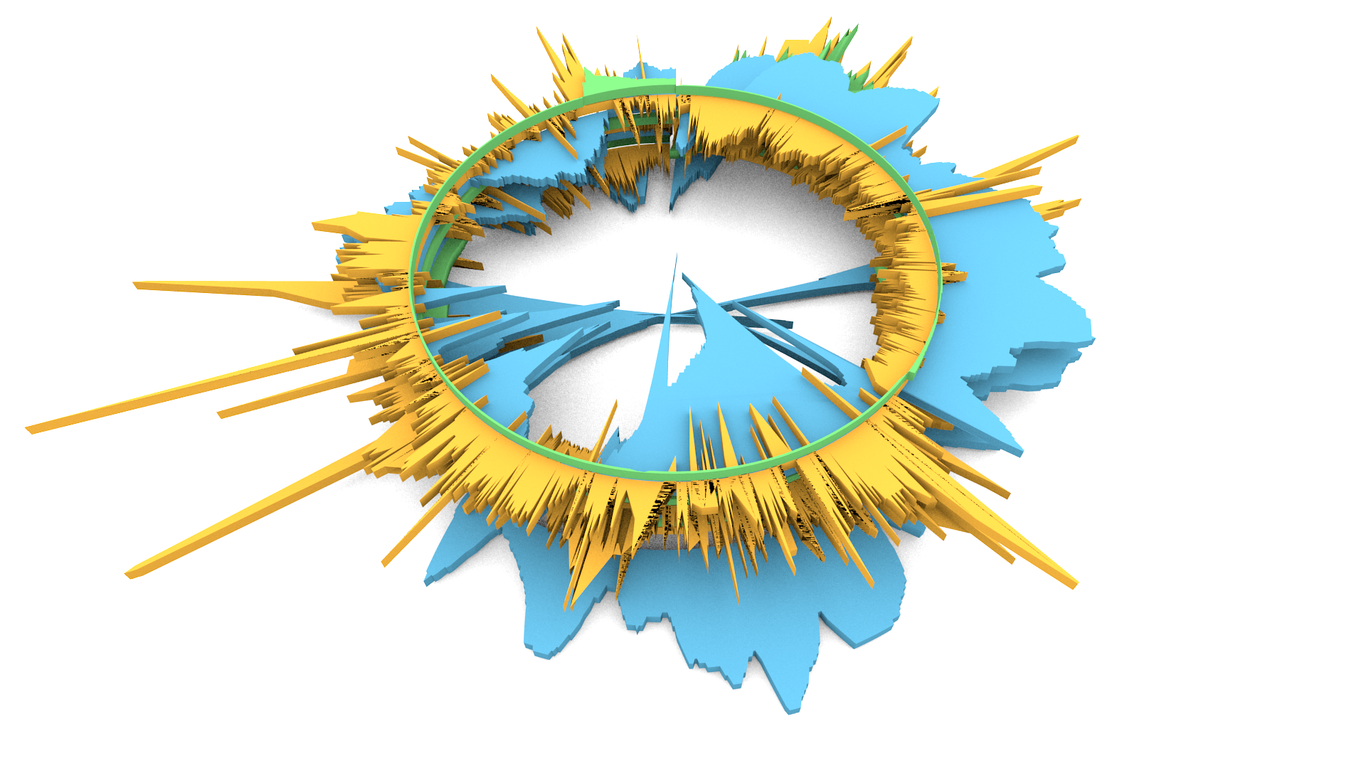
Stacked polar graphs of three different datasets
With this small experiment I found Blender to be an interesting tool for data visualisation. It’s not useful for interactive data visualisations, since the scripting is aimed at creating fixed elements from data, rather than linking dynamic data to models (maybe this is possible as well, I haven’t looked into it). Moreover, Blender includes an extensive rendering engine which enables “data artists” to create artistic masterpieces based on real data. Looking a bit into the future, you can imagine how Blender can be used to prepare these models for 3D printing, to make physical copies of datasets…